Keywords: Boxplot, box plot, stem and leaf plots, Excel 2007, how to make
Version: Excel 2007
Dowload:
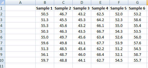
Since the previous entriesI have recieved quite a few questions about Box-plots in Excel 2007, so I decided I should describe one way to create decent looking box plots in Excel 2007. In my example I start with a set of data containing six samples with ten replicates each, and from this I want to create a box plot showing the extremes, median and the quartiles.
I create five new rows (12-16), max, 3rd quartile, median, 1st quartile and min and then calculate the statistics accordingly in cells B12:B16:
=MAX(B2:B10)
=PERCENTILE(B2:B10,0.75)
=MEDIAN(B2:B10)
=PERCENTILE(B2:B10,0.25)
=MIN(B2:B10)
Then copy to cells C12:G16.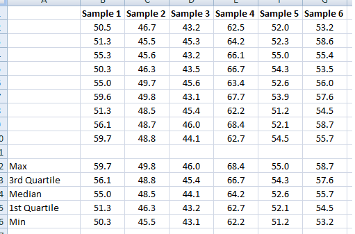
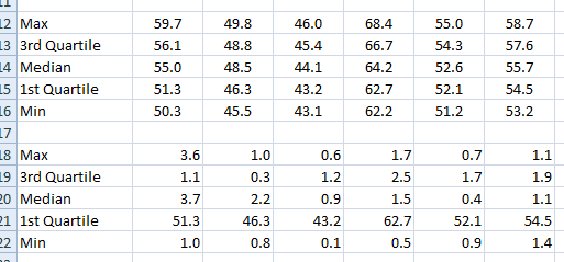
Since we will “trick” Excel to draw a box-plot and use a stacked column chart we have to modify our data slightly. The first segment of the stacked column will be invisible and end where the lower boundary of the 2nd quartile begins ( =PERCENTILE(B2:B10,0.25) ). The next segment will consist of the 2nd quartile (median-1st quartile, or B14-B15). The third segment is the 3rd quartile (3rd quartile – median, or B13-B14). The length of the whiskers representing the max and min values are calculated as 1st quartile – min or B15-B16 and max – 3rd quartile, or B12-B13.
These values are calculated in a new range, see image below.
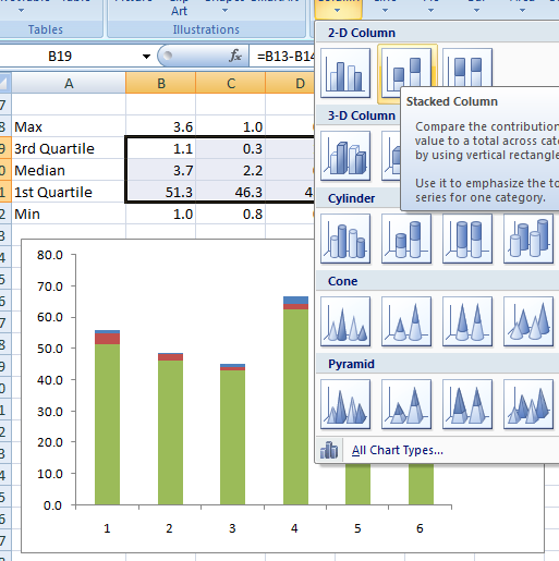
Now I’m ready to insert the chart. I select the range B19:G21 (see image below) and select a 2D stacked column from the Insert–>Table menu.
Next we add the whiskers. Select the second segment, click on Chart Tools –> Layou –> Select Error bars –> More error bars options and pick the Display Direction: Minus, indicate the Error Amount: Custom and click the Specify Value button. Leave the Positive Error Value as is and select the range containing the Min values for the Negative Error bar.
Repeat for the max value whiskers. The chart now should look like the one in the image below.
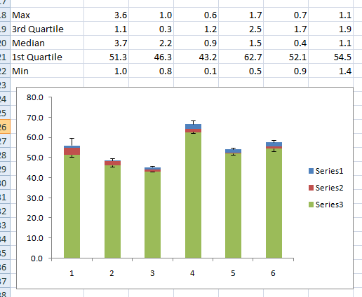
To make the chart a bit neater, right-click the lower segment series (green series in the image) and select properties and make invisible. Format the rest of the chart to your liking. Done!
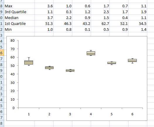
Good luck, and enjoy your new Box plots.
没有评论:
发表评论